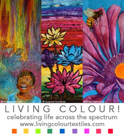
I received 171 entries from 160 textile artists for the Living Colour! exhibition that premieres at the Australasian Quilt Convention this week. Many people have asked me how I selected the 32 finalists. This post gives you some insights into my curatorial selection process and some takeaway tips. You may also be interested in these related posts:
- Living Colour Entry Statistics – a comparison of the volume and timing of entries received for Beneath the Southern Sky and Living Colour!
- Living Colour Vital Statistics – a breakdown of entries received by country of origin; predominant colour used; subject matter and design; techniques and materials.
- 10 Benefits of Online Entry Forms
Setting the title theme
While non-themed and survey-style exhibition definitely have their place, a theme can help to unify an exhibition and appeals to many galleries and other exhibition venues for promotional reasons. This travelling exhibition was always going to have a theme and it needed to be engaging. I keep a running list of potential exhibition concepts and themes. This time, I also consulted my wordsmith friend, and Beneath the Southern Sky artist, Monica Johnstone. When Living Colour! independently appeared on both of our short lists, I embraced this serendipity and set this as the theme.
To maximise participation and provide creative freedom, the theme was intentionally broad and did not prescribe any particular colour scheme, techniques, style or materials. Any kind of textile or fibre art was welcome. The only essential requirement was to address the theme and specific size and that the work be robust enough for the rigours of a travelling exhibition.
As it turned out, I received many colourful entries that, much as I pondered, did not appear to have a “living” component. I also received some drab, dare-I-say beige, works and there was even a square (not 100x40cm) black & white work stretched on a travel-unfriendly frame that depicted sushi!?
Takeaway tip: Ensure you address the theme and, if your interpretation is more tangential, at least leave a hint in your title or artist statement.
Receiving the Entries & First Impressions
I received the first submission via the online entry form almost five months before the closing date. In addition to a master database (Excel spreadsheet), I immediately set up two folders of images – one on my desktop computer and one on my iPad. From then on, as entries arrived in my in-box, I would copy the images into the folders. I also created a 240×600 pixel rough cropped thumbnail of each image for later use.
General presentation
While I naturally looked at the photos along the way, this was only cursory at this stage. It was still long enough to remark upon general presentation. As I was planning to rephotograph all selected works, I wasn’t looking for super-professional photographs – just something square/face on against a white or light coloured background.
Approximately 30% of entries were let down by their presentation including: poor lighting; excessive cropping so I could not see the edges of the work; distracting backgrounds including beds, floors, lattice, shoes and trees; crookedness and “keyholing”.� Every textile artist should ban keyholed photos from their portfolio!
 I get that textiles are tricky to photograph sometimes but these are relatively small works; easy enough to hang on a wall or door with some loops of masking tape hidden on the back and take a snapshot front on. (And if your doors are dark-coloured, throw an ironed sheet over first!)
Takeaway tip:� Learn how to photograph your work!� Here are some useful resources: How to Photograph Textile Art and Digital Photography for Textile Artists.
Image Labelling
In addition, there was only 65% compliance with the image labelling requirements. (The conditions of entry specified “Please name your file with your first initial, your last name and the word “Full” or “detail”. For example: BSmithFull.jpg and BSmithDetail.jpg “). Although nobody was disqualified on this basis, it was tedious to go through and rename so many images so that my file sorting and retrieval system worked satisfactorily.� Other curators may not bother and your entry may be eliminated as non-compliant.
Takeaway tip: Take care to label your images as directed.
Reviewing the Entries
After the closing date, I thoroughly reviewed all 342 images several times on both my desktop computer and on the iPad, the latter being ideal for zooming in on particular details. I then sorted the entries into three broad classes:
- Non-contenders (~50%) – obvious shortcomings in design or execution, in comparison with other entries, and/or failure to address theme
- Strong contenders – high visual appeal and/or the most accomplished examples of a particular technique (eg plant dyeing, painting, printing etc)
- Others
Initially I planned to select up to 30 works but, presented with a quality pool of work, I sought clearance from the confirmed venues to increase this to 32 works if desired.
Concentrating on the “Strong Contenders” folder (but not exclusively), I played around with different combinations. Using the uniform-size thumbnails I made earlier, I created various arrays on my screen and in printouts, swapping works in and out. This was an intense, multi-day exercise. Not only was I keen to ensure that a broad range of techniques and materials are represented to demonstrate the richness of the textile and fibre art medium, I sought to create cohesive exhibition with a strong narrative “celebrating life across the spectrum”. I pictured myself giving a curator floor talk and asked myself� questions: how does this exhibition flow?� how would I segue from one piece to the next? why would I include this work?� what would I say about it?
Takeaway tip: The role of the curator/juror is to create a cohesive exhibition out of the works submitted. To, in effect, “make a work of art out of works of art”.� In any juried exhibition, various combinations are available and it is possible for wonderful work to be excluded to make the exhibition flow.
After considering various approaches, I decided to present the exhibition in a broad rainbow sequence, starting with red-hued works stepping through the spectrum and finishing up with some multi-coloured works. This gave me a structure on which to build the exhibition.
As you may have discerned from the Glimpse of Living Colour preview posts, I selected predominantly high chroma works that fill the 100x40cm space with saturated colour.� I received the works at the end of February.� It is a super collection and I am excited to share it with you in the cloth on tour in 2014/2015 and online very soon!
For more curatorial insights, I invite you to join me on one of my floor talks – daily at 1.30pm at the Australasian Quilt Convention (Melbourne: 10-13 April) and daily at 12.30pm at the Creative Textile Show (Canberra 2-4 May).


Marilyn Wall says
I love color. Wish I could see this in person. Any chance it will come to the US?
Brenda Gael Smith says
Hi Marilyn – yes, Living Colour! will be in the US. It is a special exhibit at AQS QuiltWeek, Grand Rapids in 2015. Look out for details of the expanded exhibition tour in the next few days.
Brenda Wood says
Excellent insight. Thankyou.
Margaret Ford says
Thank you Brenda for such an illuminating view of the curatorial process. Very useful!