
As part of my continuing series for my Curator Knowledge Resources page, this post sets out a method for designing an exhibition layout to scale using Photoshop Elements software. I find it a useful way to help visualise the exhibition and you may too.� (NB: This tutorial is in metric but you can apply a similar approach with imperial measurements.)
Step by Step Checklist
In the past three weeks, I have designed the layout for three different exhibitions. Or, more precisely, I have been allocated certain exhibition space and I have designed the hanging order of the selected works to best complement the flow of the exhibition and to check that the exhibition will actually fit!� In each case, I followed the same checklist:
- Venue Floorplan: Obtain the floorplan from the gallery or event organiser including height and width dimensions of all relevant walls along with details of protrusions, obstacles or furniture that needs to be taken into account.� Some venues will give you a very precise diagram.� Others may be a hand-drawn sketch.� The most important thing is to have the correct wall dimensions.
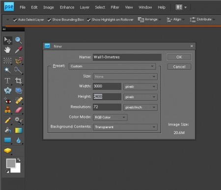
- Number each wall and create a separate file for every wall:� For example, for a wall that is 3metres by 2.4metres (width x height) go to: File>New>Blank File and set dimensions of 3000x2400pixels at 72 pixels resolution with a transparent background.� Save the file in PSD format.
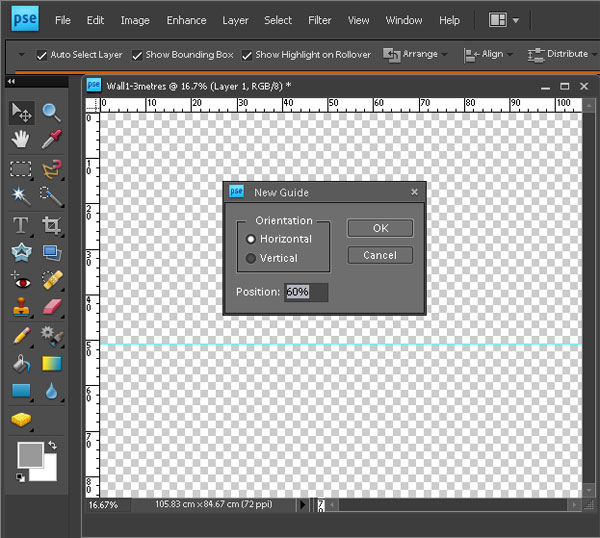
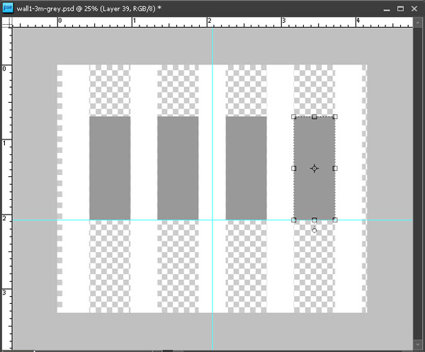
While you are at it, insert a horizontal snap-to guide via View>New Guide>Horizontal to set the hanging height. As a rough guide, if you are hanging large works� that fill the wall, set the horizontal guide to 50% to centre the works horizontally.� For multiple works of varying sizes, set the horizontal guide to the desired eyeline.� For smaller, uniform size works, set the horizontal guide to the desired baseline. In this example, the guide is set at 60% which is 96cm (2.4m – 60%/1.44m) from the floor as a resting point for the bottom of the works (see diagram in Step 5 below).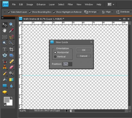
- List of Works & Images:� make a list of works to be exhibited including dimensions in centimetres and check that you have an image of each work without any extraneous background (roughly crop out background if required).
- Make Scale Images of Each Work:� Resize each image so that, for example, a 100x100cm work is 1000x1000pixels; a 100x40cm work is 1000x400pixels and so on.� You may need to uncheck the “Constrain Proportions” box to get the desired dimensions. (See my earlier tutorial Seven Easy Ways to Resize Images.)
- Audition Works on Walls:� Using the layer functions in Photoshop Elements, audition works on each wall (eg Open image file>Select> All>Edit>Copy� and then open the “wall” file and Edit>Paste).� Play around with different variations.� Keep in mind that the role of a curator is to create a flow within the exhibit:
I recently had a conversation with the director of a small museum who described putting together a show as creating a work of art from works of art. Like any good artwork, a show must have balance, the colors must make sense, and the overall composition must read well.
That the pieces are cohesive and flow from one to another in a way that complements them is paramount. A show that is not thoughtfully selected and hung with equal care and consideration is just a mismatched collection of pieces, and even if each one individually is superb the end result will not be successful.
Leni Wiener, Chair, Exhibition Committee
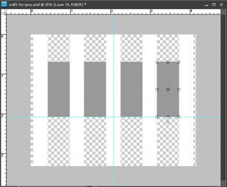
Studio Art Quilt Associates Quote used with consent.When you are happy with the layout, save the wall file in both PSD and JPG format.� This screenshot shows four greyed out Living Colour! works on a 3metre wide wall. Because I wanted the works evenly space, I also created a “spacer” graphic (shown in white) that extends from the floor to the top of the wall.
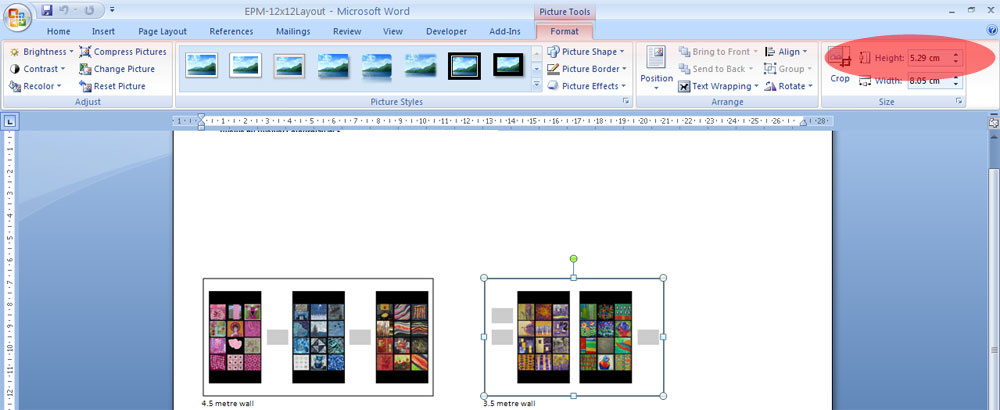
- Create Master Layout File: After you have created a jpg file for each wall, insert these image files into a Word document (or equivalent). Depending upon the dimensions of your walls, it is likely that you will have to resize the image files within the Word document Just make sure that you do this in a consistent fashion. For example, if all your walls are the same height, set the height dimensions to the same size.� In this screenshot, the height is set at 5.29cm within the Word document.

This screenshot from my layout for the exhibition of Australian quilts at Carrefour European du Patchwork/European Patchwork Meeting 2014 shows a compilation of walls with a works of varying size.
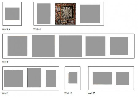 Sample Master Layouts

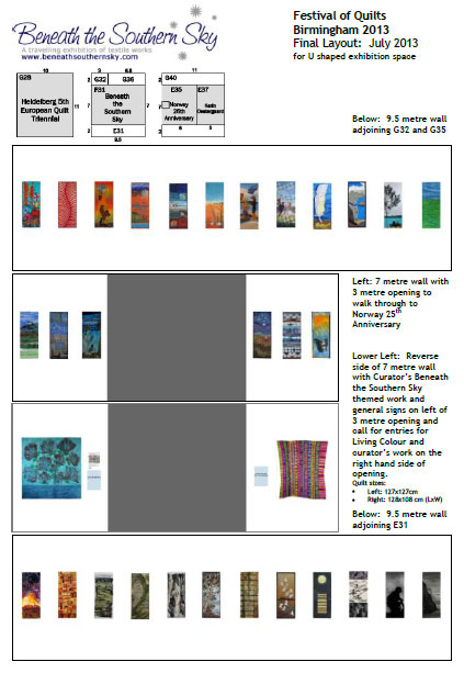
Here are a couple of master layout diagrams.� In both cases, I have included some annotations showing signage to scale. Such diagrams are especially useful for sharing with the venue or if you are giving installation instructions to a third party.� The first diagram is for Beneath the Southern Sky at Festival of Quilts in Birmingham 2013 where installation was in the capable hands of Helen Conway:
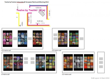
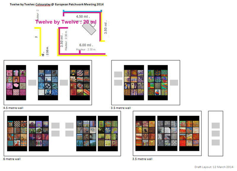
 The second diagram is for Twelve by Twelve Colourplay at Carrefour Européen du Patchwork in September 2014:
 3-Dimensional Diagrams
The method set out in this blog post generates a two-dimensional layout.� In her blog post The Value of Questions – aka Smithsonian Prep, Lisa Call shares her some of her process in creating a 3-D display of her proposed stand at the Smithsonian Craft Show.
If you would like to create a 3-D display, go to Step 4 above “Make Scale Images of Each Work” , then consistently reduce the size of the images so that you can print out at a workable scale. Cut out your printed images and then audition on cardboard walls constructed at the relevant scale.� (A cat assistant is optional!)
Curator Caveat
However well you plan, on installation day, you may find that conditions have changed and you may have to rejig your layout to fit the actual configuration. Who knows – you may come up with something better! Nevertheless, whether your layout diagrams are two-dimensional or 3-D, I am sure you will find that they are a useful tool in planning your next exhibition. Please share your tips on how to play an exhibition layout.

Alicia Merrett says
This looks like a great tool Brenda, which I hope to be able to use, as I have two exhibitions to design soon – my own gallery at the Festival of Quilts, and SAQA’s Wide Horizons IV at Carrefour du Patchwork. I have Photoshop CS6 rather than Elements, but I expect I will be able to work out any differences.
Brenda Gael Smith says
Alicia, both Twelve by Twelve Colourplay and the Australia Quilts guest country exhibition will be at the same Carrefour du Patchwork venue as Wide Horizons IV. I do hope we get to meet in person!
Betty Warner says
This was great! Thanks so much.
Brenda Gael Smith says
Thanks for stopping by Betty. I hope you find this helpful.
Alicia Merrett says
That’s great! I look forward to meeting you! I’m originally from the Southern Hemisphere too – but on the other side – Latin America.
neroli says
I was right with you until you said the four letter ‘w’ word. 🙂
Brenda Gael Smith says
If you are talking about putting the master layout into a Word document Neroli, I did say “or equivalent”…
neroli says
You did, but the equivalent is still a word processor 🙂 It was still the right thing for the blog post though, just a something that makes a grapho shudder 🙂
Great for most people – horrible for me, not only is writing a letter pushing the boundaries of my ms word knowledge but I could knock it out in illustrator or indesign in seconds.
Ellen Lindner says
Very useful info. Two more things I consider: the hanging height, and (when appropriate) the number of pieces needed to fill the space.
– I hang the middle of all artwork at 60″ from the floor. Therefore, I label my hanging slats with “suggested hanging height,” making things easier down the road.
– In the cases you described you were given a set amount of pieces. When hanging a solo show, I have to decide “how many pieces do I need to visually fill the space without making it look crowded?” My answer is to loosely have half of the linear space showing art and the other half showing wall.
Brenda Gael Smith says
Thanks for your input Ellen. Hanging height is certainly an important consideration. I cover this in Step 2 above by addiing a snap-to horizontal guide to my “wall” files. In my screenshot example, I placed the guide at the 60% point to set the desired “baseline” being the distance from the floor to the bottom of the work in the particular scenario. You can see the works resting on this baseline in the diagram at Step 5. Of course, the optimum hanging height may vary from venue to venue depending on the height of the walls; the size of the works and how large the overall space is -ie how far back you can stand from the works.
In your example, where you wish to centre all artwork at a particular height from the floor, you would set the snap-to horizontal guide at the relevant centering point on your “wall” file. Then when you audition your image files on the wall, the centre of those images will automatically “snap” to the guide. Very handy!
And yes, regardless of whether you have a set number of works or a larger pool to choose from, it is vital to balance the works with the wall space to enhance the flow of the exhibition. That’s where I find a digital mock-up so useful to help me visualise the size of the works against the wall.
This sense of scale is sometimes missing when jurors are selecting works from electronic submissions. I have heard jurors remark that they did not fully appreciate the size of the work (big or small) until they physically saw the work.
Alicia Merrett says
Thank you Ellen and Brenda for your further input on hanging work in a gallery. I recently had an excellent experience of the effectiveness of white wall space. A couple of weeks ago I had an exhibition at the Spanish Patchwork Festival in Sitges. I had no idea what the space would be like. It turned up trumps. My dozen or so quilts looked wonderful in the space, with lots of white wall in-between. You can see some views of my exhibition in today’s post in my blog, http://aliciamerrett-colourandlight.blogspot.com.
It can be difficult at times to fit the amount of work in a given space; in Ste Marie, I know I will have 50 metres of wall to fit about 35 quilts – so not too much wall space left… But since the Spanish exhibition, I am rethinking the layout of my gallery at the Festival of Quilts.
Sarah Ann Smith says
Thanks Brenda! I’m curating the Food! exhibit for SAQA this coming Fall, and this will come in handy! Bookmarked!
Vivien Zepf says
Thank you for sharing this! It’s very helpful.