• Skip to primary navigation
  • Skip to main content
  • Skip to primary sidebar
  • Skip to footer
  • Email
  • Facebook
  • Instagram
  • YouTube
Serendipity and the Art of the Quilt

Serendipity and the Art of the Quilt

Creating with Brenda Gael Smith

  • WEBSITE
  • About
    • Biography
    • Resume
  • Shop
  • Gallery
    • Serendipity Gallery
    • Contemporary Textile Art
    • Monthly Art Project 2019
    • Weekly Art Project
  • Workshops & Programs
    • Workshop Booking Form
    • Overview
    • Workshops Brochure
    • 3 Hour Zoom Workshops
    • Schedule
    • Lectures & Programs
    • Abstraction from Reality
    • Bound to Please
    • Creating with Felt
    • Circular Explorations
    • Improvisation Plus
    • Lines of Beauty
    • Logs & Ladders
    • The Modern X
    • Shibori Serendipity
    • Stacks of Improvisation
    • Strata Various
  • Resources
    • Copyright Resources
    • Tutorials
    • Melody Quiltalong
  • News/Events
    • Calendar
    • Newsletter Sign Up
  • Blog
  • Contact

Ragged around the edges

22 October 2007 Filed Under: ATCs and Postcards, Technique:Finishing

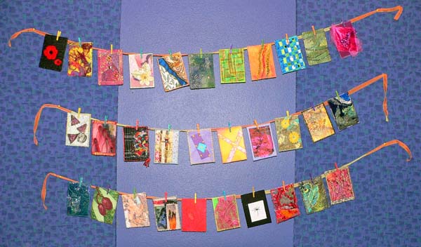
At Saturday’s Guild meeting, Erica shared her collection of Artist Trading Cards. Here is just a small sample:
Erica’s Collection of ATCs at Burwood
I haven’t made many ATCs partly because I don’t enjoy working in such a small scale and partly because I get dissatisfied about the finish I achieve. My satin stitch edging invariably ends up uneven, shaggy and ragged. So it was with some trepidation that today I decided to try out a satin stitch finish on one of the contenders for my quilt in the Twelve by Twelve dandelion theme challenge. I can’t show you the quilt but I am reasonably happy with how the black satin stitch “binding” turned out. There were some parts where the light coloured batting obstinately showed through but nothing that a pigma pen won’t fix!

Reader Interactions

Comments

  1. Diane says

    23 October 2007 at 4:13 AM

    I know what you mean about not being sure about this type of edge finish. I see a lot of different results when people try to use this satin stitch edging. Some people manage to do it so it looks smooth and effective, and other time I’ve seen it look weird and haphazard and, to my eye, messy and amateurish. I gather that the trick is to do various “laps” around, with increasing widths of satin stitch to result in a smooth, even coverage.

  2. sue says

    23 October 2007 at 4:12 PM

    Like you, I find a pen helps hide the light colours, although I often use a long overlock stitck so it tidies the edge but doesnt hide the colors of the design- though need to pay attention to colour of thread used

  3. Liz says

    24 October 2007 at 5:52 AM

    I have the same problem as you and so I deliberately make the edges ragged by using a stitch I have on my machine which is a bit like a long and short stitch but more uneven than that …. it goes with the sort of style I have so it doesn’t matter that it isn’t precise satin stitch.

  4. Helen Svoboda-Barber says

    25 October 2007 at 7:55 PM

    Do you know the trick about cutting the batting 1/8 an inch smaller than the front/back of the quilt when you’re doing this type of binding? It keeps the batting from showing through.
    However, since I don’t think about finishing until…well, finishing my quilt, I never seem to cut the batting smaller. 😉

Primary Sidebar

Blog Posts Straight to Your In Box


Blog Archives

Serendipity Studio Newsletter

Categories

Recent Posts

  • Zig Zag Pizzazz at the Australasian Quilt Convention 2025
  • Glioblastoma: Statistics and Stories
  • Learn with me: 2025 workshops
  • Forza Vitale: Phosphorescence
  • Bodacious Beads at QUILT2024 Summer Camp

Footer

Contact

Brenda Gael Smith
brenda@serendipitypatchwork.com.au

PO Box 131, Avoca Beach
NSW 2251 Australia

Serendipity Studio News

Sign up for periodic updates from my studio - new artwork, workshops, exhibitions and other news

  • Email
  • Facebook
  • Flickr
  • Instagram
  • Pinterest
  • YouTube

New on Instagram

Beginning like I mean to go on. On a deadline - wi Beginning like I mean to go on. On a deadline - wish me stamina and fortitude.
#forzavitale #stillstanding #brendagaelsmithart
Thanks to @centralgoldfieldsartgallery in Maryboro Thanks to @centralgoldfieldsartgallery in Maryborough, Victoria for the opportunity to share my artwork in Golden Textures 2025. 

Forza Vitale: Phosphorescence will be on exhibition from 28 June to 12 October 2025.

Plan an art excursion!

#brendagaelsmithart #goldentextures2025

Copyright © 2003–2025 All Rights Reserved · Brenda Gael Smith